


Do you identify as a Mocha Check Girl?
Unpacking the big business of brown with Rebecca Proctor ☕

As many of you already know, Pantone chose Mocha Mousse as the 2025 Color of the Year. I voluntarily ignored most of the discourse around this announcement because everything at the end of the year is exhausting, but after reading Elizabeth Goodspeed’s hot take about who this color is for, I found myself questioning... myself. Despite harboring very strong feelings about the “greigification” of interiors (please let the record show that I have nothing against the “sad beige moms”), I can’t deny that I’ve been on a bit of a brown bender for the past sixish years. It all started with a desire to add more pieces to my wardrobe that then evolved into the furniture that housed it.
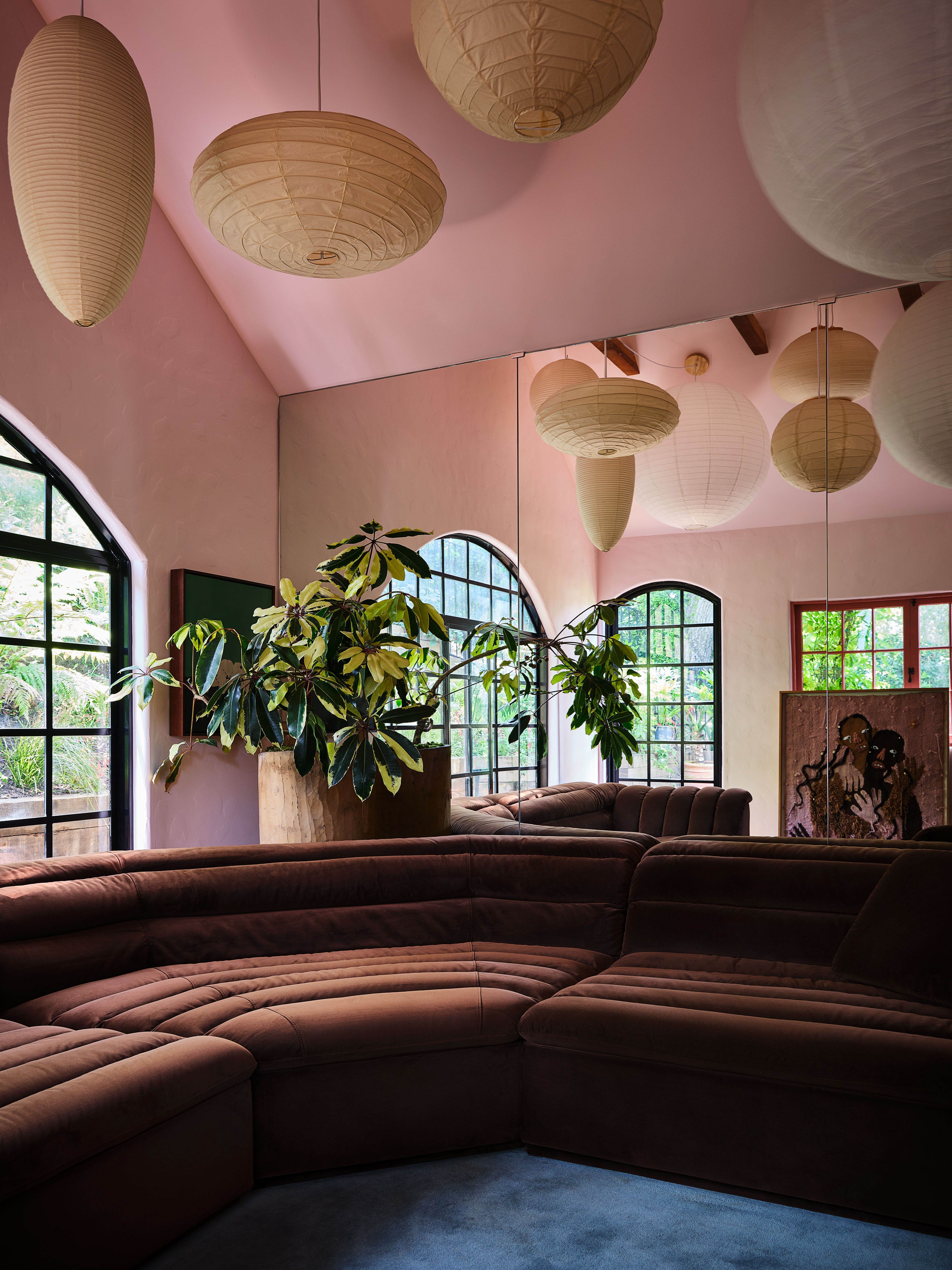
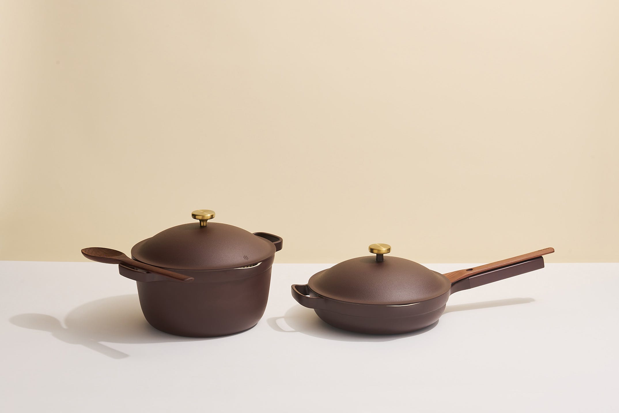
No matter the hue, brown is a color of substance; it’s not overly indulgent because it’s rich in spirit. Chocolate, espresso, caramel, and cognac browns are a few of my favorites, serving as the ideal neutral for those of us that feel grounded when surrounded by earth-toned hues. (Are these considered “non-controversial” shades of brown? Asking for a friend…) I knew I was in too deep when Ellison Studios added Piccolo to their signature brand colors in 2022—there was officially no turning back. Brigette Romanek recently collaborated with Our Place on a delicious set of espresso brown cookware, which she described as a “timeless, elevated palette that transforms any kitchen into a space of beauty and intention.”
I never thought of this gradual shift as part of a larger consumer trend, but in the years to come a full-on resurgence would be carried out by everyone with stock in the game. Now, brown is the new black or something to that effect. While I don’t believe that I’ve been mindlessly buying into a color scheme, the marketing around it has felt like a collective push to almost “not see color” in recent years. So, what happens when a color becomes your entire personality or identity?
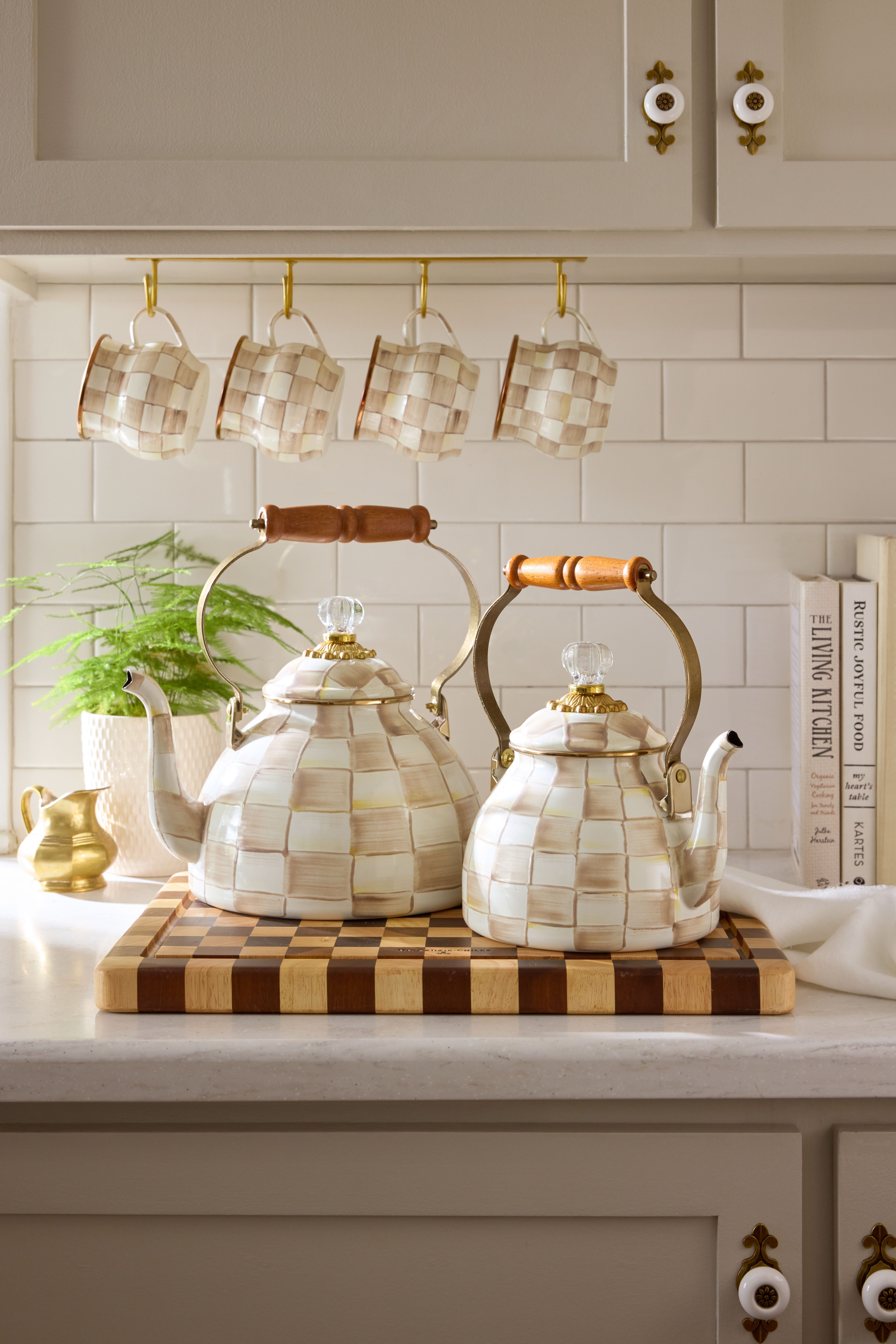
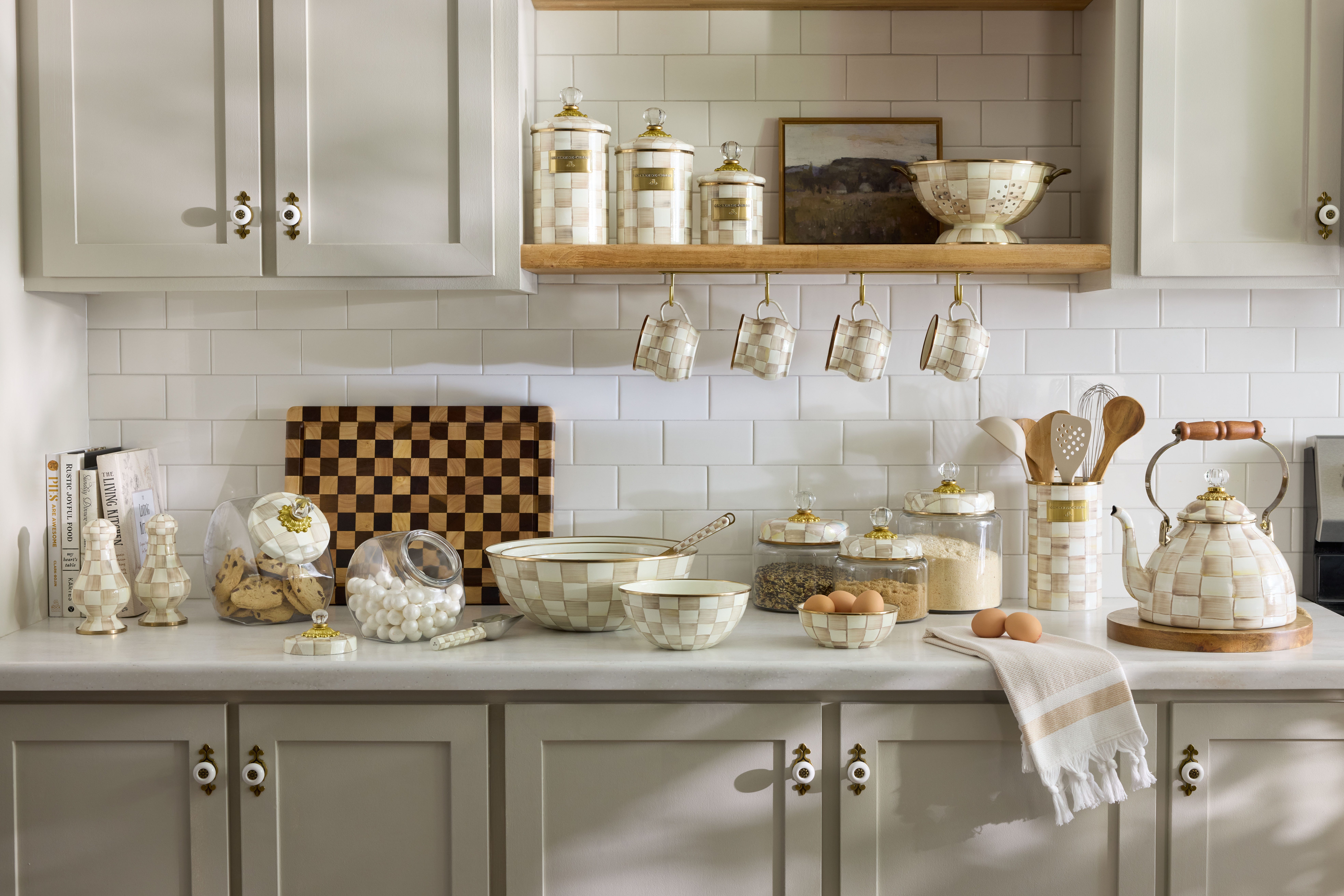
Last month, MacKenzie-Childs introduced a “new neutral” to their collection called Mocha Check. (Some of you are probably thinking that the brand is hopping on the trend train, but they started testing it on these decorative pumpkins last October.) Given that this company doesn’t drop new colors every calendar year—Sterling Check debuted in 2022, followed by Rosy Check in 2024—I needed to know why this particular hue felt right for 2025 so I hopped on a call with Rebecca Proctor, Chief Brand Officer and Creative Director of MacKenzie-Childs since 1991, and she spilled all the tea.
This interview has been edited and condensed for clarity.
What was the inspiration behind Mocha Check?
Rebecca Proctor: We refer to all of our checks as underpinnings; you can layer lots of things on top of them. Typically, when we design a check, we also design a floral and maybe a plaid or a tartan to to go with it; they’re these wonderful constant pillars to build on… With Courtly Check being so distinctive, so strong, and so iconic for MacKenzie-Childs, we thought “What’s the softer approach to getting a check into more people’s homes?” When I think of Mocha Check, it reminds me of the relaxed linen flax shirt I want to wear all the time. It’s got beautiful shades of chocolates and mushrooms and soft browns paired with our creamy white—it’s not an optic white, it’s a really warm white. It’s really inviting and makes it very easy to live with and layer into other things. I think that’s what why it’s having such a strong appeal.
How long has this pattern been in the works?
RP: Anytime we launch a new pattern, it is an 18 month design cycle from start to finish. Because the origin story of our patterns are all hand painted art, that’s where it begins. It was really taking time to make sure we had the exact palette we wanted and that it was achievable in the materials we plan to work with. Sometimes, depending on the materials, you’ve got design constraints, especially with food—you have to be very careful about lead and cadmium content. You’ve got to be careful about choosing that perfect color.
We worked on Mocha for a good two months to get it just right and it was hand painted. Sample after sample after sample after sample. Using different materials doesn’t mean they’re always going to perfectly align, but they’re all members of the same family. It’s a long, arduous process, so when we select a color we do it with absolutely the utmost of care. There’s a lot of conversation around it, the whole design and development team is talking about it. We talk about a muse for it: “What is this customer like? How does she live? What does she want to see in her home? How can we bring Mackenzie-Childs into her environment?” So colors are really, really carefully considered.
Pantone describes Mocha Mousse as a warm, nurturing, and rich hue that is “answering our desire for comfort.” What does Mocha Check mean to MacKenzie-Childs?
RP: Our reason for Mocha Check is to demonstrate to the customer that we want to live in your life. We want to bring happy to your home and we can do it in any shade. We ebb and flow in and out of popular colors and trends in fashion, right? I think flax and linen colors, and natural colors that are earthy, speak to people [because] they’re easy and comfortable. That is what Mocha represents for us. We choose colors as foundational colors that we think will have long legs into your life. They’re not really hot, punchy, or trendy necessarily.
We want to represent longevity and things that you can really live with and enjoy for a long time, and in some cases even pass them down. I think that’s important. There are all sorts of reasons why colors come and go, but I have a really strong feeling that brown is here to stay. It’s always been here; it’s been woven into textiles for thousands of years, it’s a natural color in marble, stone, and wood. We’ve lived with cool colors in our home for a long time, gray really had a big resurgence moment. Brown is warm and inviting, you kind of want to wrap yourself in it when it’s time to cozy up in your home.
From your POV, why does “mocha” brown feel so right for right now?
RP: I love the color brown, but think how many shades of brown actually exist. If you were to open a fan deck of color right now, there are hundreds and hundreds of browns. What I love about our Mocha Check is that because each check is literally a brush stroke, we’re dipping it in shades of brown to drag those individual colors through each check. That’s the celebration of all the browns that I love to live with, whether it’s light or dark or chocolate or beige or tan. Brown is a very important color this year and I wonder if it has something to do with the idea of sustainability, protecting the planet, and being engaged with the earth. I also think it’s a beautiful blending color: It’s fabulous with black. It’s amazing with blue. It’s beautiful with rose. It’s delicious with gray.
Sterling Check came out not long after Ultimate Grey was named as one of Pantone’s Colors of the Year in 2021. Have these COTY campaigns become a motivating factor for a brand like yours when conceptualizing fresh palettes to attract both old and new customers?
RP: We launched our [Mocha Check] pumpkins before we knew what that color of the year was going to be. We had absolutely no idea to be honest with you, it was serendipitous for sure. Maybe that’s why it’s striking a chord, but that was funny timing. We were so delighted by that. We want people to live with MacKenzie-Childs, it should be comfortable in your home. Your home is the place you want to go to at the end of the day that makes you feel really, really, really good. It represents who you are, it’s your diary. You want to surround yourself with things that you love, that are comfortable, and that push your happy buttons. That’s really what MacKenzie-Childs’s mission is, to bring the joy to home.
There are so many people producing so much stuff today and we want our things and designs to resonate for reasons that have integrity: They should be happy. They should make you feel good. They should be things you want to use. They should represent function as well as form and design. We’re always going to be about pattern because for us that’s part of the playful side of MacKenzie-Childs; mixing them together in irreverent ways sometimes is always nice for us too. We try to do it thoughtfully to give you options to put combinations together.
We think really hard about colors people want to live with, that’s where it starts. We choose that color and then build themes and stories around it involving all the different wonderful product categories we make, from lighting to rugs to furniture to dinnerware to decor and textiles. We try to wrap our heads around bringing the pattern to life through those different mediums and it speaks to our customer. We don’t tiptoe into anything, you know that—we’re charging in with a color like “We’re here!” This year it’s Mocha Check.
What are your thoughts on the “greige/beigification” of interiors? Why do you think we’re seeing this collective shift toward brown?
RP: I still love all those different beautiful grays that are available to us—our Mocha actually looks really great with Sterling, they look sensational together. I think we’re migrating a bit from cool and cold to warm [tones]. I love what’s expressed in warm colors, it’s a cozier feeling. Maybe that’s what’s speaking to people… There are people that are pattern centric and then there are people that want to live in a really neutral box; it’s a neutral stage to set all your favorite things in that make each object pop and feel more important. Mocha can live in both arenas, traditional and modern. It can live in a patterned arena or be that beautiful thing that stands out in an all-white interior. [Mocha] is going to blend beautifully in either of those scenarios, it’ll look really, really great.
It’s fun to watch the younger generation of our customer, how her home is evolving and how she’s starting to collect. It was an idea that Mocha would be really familiar and welcome in that environment of a more neutral space in the way that she’s living now—I think it’s working. We’ve opened a conversation to more people, to a bigger audience, on how to live with MacKenzie-Childs in a way that makes sense to you. It’s colorful, it’s playful, and it’s happy. That’s our mission, that’s why we’re here. The world does not need another white dinner plate. We are not here to do that; we’re here to do something with a point of view. Home is absolutely where our whole heart is, and we can be on the front porch, in the living room, in the dining room, and all over your kitchen.
loved this! you were sooo early to the brown craze of our current moment, as per usual o:)
I loved this! And, for whatever it's worth... I too have a lot of brown stuff 🤎🙈